Of Scurvy in the Army
Recreating Florence Nightingale’s Diagram of the Causes of Mortality in the Army of the East with ggplot2
Tags: R, ggplot2, rose chart
Introduction or The War in Crimea
It feels quite weird to start blogging. I don’t use Instagram, Twitter, Facebook or Tiktok. I like to turn my phone silent during the day. I don’t particularly enjoy advertising myself online, but I’ve learned a lot by reading hundreds (if not thousands) of blog posts over the years and this seems like the best way to share my own thoughts and ideas. In long form rather than 140 characters.
This being my first post, it seems only fitting to share how I made the logo for the website. Let me take you on a wild ride through history, healthcare and the pitfalls of data visualization with R.
In July 1853 czar Nicholas I tried to expand Russian territories against a declining Ottoman empire. Russia quickly occupied the Danubian Principalities of Moldavia and Wallachia in modern day Romania and war expanded all throughout the Black Sea and its western shores. Fearing an Ottoman collapse, the British and the French ordered their fleets to enter the Black Sea in January 1854. Soon after the Austrian empire entered the war and started pushing back the Russian forces from the west. The czar and his generals had underestimated the unity of the west.
Conditions on the front lines were harsh. On top of the constant dangers of armed conflict, food rations were small, support and medical staff were underrepresented and overworked, hygiene standards were basically non-existent. Mass infections were common and medicines to treat them were constantly in short supply. This, however, was the reality of nearly every war at the time. It took Florence Nightingale and her Diagram of the Causes of Mortality in the Army of the East to completely change the standard of care and reduce the death rate in the British troops from 42% to 2%. Her findings would have far-reaching implications not only during the Crimean War, but for hospital care around the world and until this day.
Nightingale and her staff of 38 volunteer nurses reached Istanbul in November 1854 to treat wounded soldiers who had been sent there over 500 km away in the Crimea. During her first winter there she noticed that out of the 4077 patients who died, more than 90% died of avoidable illnesses such as typhus, typhoid, cholera, and dysentery. In February 1855 Nightingale sent a report to the London newspaper The Times, lamenting conditions at the camp. As a response to her report a prefabricated hospital was shipped from England to the Dardanelles, the sewers were flushed out and ventilation was improved, greatly reducing death rates over the following years.
The Rose
These extraordinary achievements, however, might have been largely forgotten had Nightingale not published her book Notes on matters affecting the health, efficiency, and hospital administration of the British Army less than four years later, which can be read in full on archive.org:
In the years following, Nightingale would lobby heavily for public health legislation, which was in dire need. Half of all children in urban areas were dying before age 5. The average life span across Britain was at a mere 40 years, with some areas such as Liverpool even lower at only 26 years. 4 out of 10 deaths were from infectious diseases and therefore often avoidable. In 1875, finally, her efforts were rewarded with the Public Health Act, which subsequently improved the average life span to over 60 years.
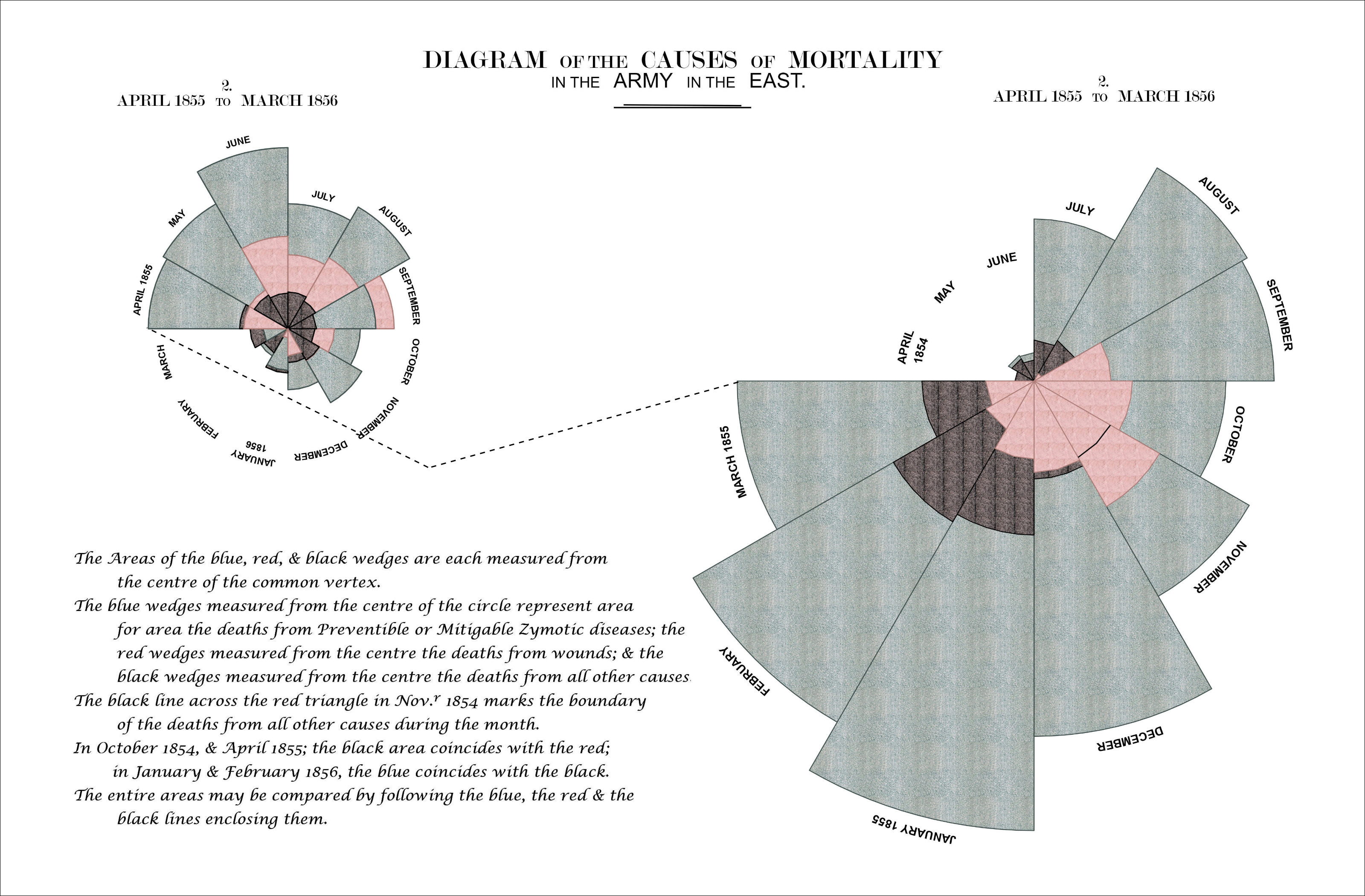
Much of Nightingale’s success is often credited to the most famous diagram in her 1858 book, the Diagram of the Causes of Mortality in the Army of the East. It shows that the death rate from zygotic disease (largely avoidable infections) was not only higher than for any other cause, but also higher in the first year of the war, before improvements in sanitation were implemented.

Figure 1: Florence Nightingale's beautiful 'Diagram of the Causes of Mortality in the Army of the East'
The diagram consists of two main parts: on the right, the number of deaths at the camp in the first year of the war (April 1854 - March 1855), on the left the deaths during the following year (April 1855 - March 1856). In each of the graphs, causes of death are color coded, blue representing zymotic diseases, red wounds and injuries and black all other causes. The numbers for each month are presented in a circular fashion and area of each of the 12 slices – measured from the center – represents the numbers of deaths. The color coded areas are therefore overlapping.
The circular fashion in which Nightingale presents the progression of each year as well as her mastery of color make the Rose visually appealing. The message is immediately clear as well: those blue areas are bigger than the red and black ones together, but they become smaller over time. In the following post I will show how to recreate Nightingale’s famous diagram using R with ggplot2. In the progress we will touch on several subjects, such as:
- changing the type of font used in your graphics (with extrafont)
- using patterns or textures rather than fill colors (with ggpattern)
- adding circular coordinate systems to your ggplot
- using html to customize text and label appearance in your graphics (with ggtext)
- removing annoying whitespace around your plots when plot.margins just won’t do
- and finally arranging several figures and images (with cowplot and patchwork)
Recreating the Rose in R
In order to recreate the diagram, I copied the data Nightingale published in her book Notes on matters affecting the health… into a csv file named TableNo2.csv. You can find the csv in this blog post’s github directory and use it however you please.
suppressPackageStartupMessages(library(dplyr))
suppressPackageStartupMessages(library(extrafont))
suppressPackageStartupMessages(library(cowplot))
suppressPackageStartupMessages(library(ggpubr))
suppressPackageStartupMessages(library(patchwork))
suppressPackageStartupMessages(library(here))
library(magrittr)
library(ggplot2)
library(ggpattern)
library(geomtextpath)
library(ggtext)
library(jpeg)

# Read in the data
scurvy <- readr::read_csv("TableNo2.csv", show_col_types = FALSE)
knitr::kable(head(scurvy, 6))
| Year | Month | Estimated Average Monthly Strength of the Army | Zymotic Diseases | Wounds and Injuries | All other Causes |
|---|---|---|---|---|---|
| 1854 | April | 8571 | 1 | NA | 5 |
| 1854 | May | 23333 | 12 | NA | 9 |
| 1854 | June | 28333 | 11 | NA | 6 |
| 1854 | July | 28722 | 359 | NA | 23 |
| 1854 | August | 30246 | 828 | 1 | 30 |
| 1854 | September | 30290 | 788 | 81 | 70 |
Because I copied the data just like it was presented in the book, it first needs to be transformed into long format before plotting. The new column Cause of Death is turned into a factor to have more control over how the colors are plotted later on.
scurvy %<>%
  select(-`Estimated Average Monthly Strength of the Army`) %>%
  tidyr::pivot_longer(
    cols = c("Zymotic Diseases", "Wounds and Injuries", "All other Causes"),
    names_to = "Cause of Death"
    ) %>%
  mutate(
    Month = factor(Month, levels = month.name, labels = month.name),
    value = if_else(is.na(value), 0, value),
    `Cause of Death` = factor(
      `Cause of Death`,
      levels = c("Zymotic Diseases", "Wounds and Injuries", "All other Causes"))
    )

knitr::kable(head(scurvy, 9))
| Year | Month | Cause of Death | value |
|---|---|---|---|
| 1854 | April | Zymotic Diseases | 1 |
| 1854 | April | Wounds and Injuries | 0 |
| 1854 | April | All other Causes | 5 |
| 1854 | May | Zymotic Diseases | 12 |
| 1854 | May | Wounds and Injuries | 0 |
| 1854 | May | All other Causes | 9 |
| 1854 | June | Zymotic Diseases | 11 |
| 1854 | June | Wounds and Injuries | 0 |
| 1854 | June | All other Causes | 6 |
Now reading through Nightingale’s description, she used the area to scale the slices rather than the distance from the center. The easiest way to do this should be to transform the input data. The area of a circle sector is given by \(A=r^2 \alpha / 2\), where \(\alpha\) is the angle (30 degrees in this case) and \(r\) is the radius. That means we have to transform our value column such that \(r = \sqrt{2*value / 30}\)
scurvy %<>% mutate(r = sqrt(2*value / 30))
From a modern point of view, this might have been a bad choice: evaluating the area of overlapping pie slices seems error prone and can lead the reader to underestimate the true differences between the numbers. Nevertheless, the easiest way to implement this particular style of presentation is to transform the data before plotting.
1 April 1854 to March 1855
Because the graphic is split into two distinct parts, I start by only selecting the relevant months for the first plot.
scurvy1 <- scurvy %>%
  filter(
    Year == 1854 | Year == 1855 & Month %in% c("January", "February", "March")
    ) %>%
  arrange(Year, Month) %>%
  mutate(
    tmp = as.factor(rep(1:12, each = 3)),
    `Cause of Death` = factor(
      `Cause of Death`,
      levels = c("All other Causes", "Wounds and Injuries", "Zymotic Diseases")
      )
    )
Then, because the areas are overlapping, it is easiest to make three new data sets – one for each cause of death. This is also necessary because geom_bar_pattern appears to fail when trying to plot an area of 0 in combination with coord_polar.
scurvy1a <- scurvy1 %>%
  group_by(tmp) %>%
  filter(`Cause of Death` == "Zymotic Diseases") %>%
  ungroup()
scurvy1b <- scurvy1 %>%
  group_by(tmp) %>%
  filter(`Cause of Death` == "All other Causes" & r > 0) %>%
  ungroup()
scurvy1c <- scurvy1 %>%
  group_by(tmp) %>%
  filter(`Cause of Death` == "Wounds and Injuries" & r > 0) %>%
  ungroup()
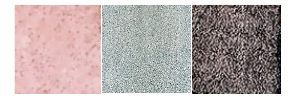
In order to use background patterns that are true to Nightingale’s original work – which was drawn using crayons – three pictures need to be saved. Each one contains a representative area cut out from the original graphic that can be used to define the respective color. A vector containing the paths to each of the images is defined.
images <- c(
  "color_death.jpg", "color_zymotic.jpg", "color_other.jpg"
)
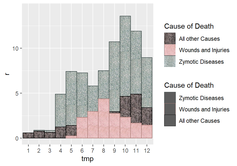
In the next step, a simple bar plot with with several important twists is created. Rather than ggplot2::geom_bar, we use ggpattern::geom_bar_pattern, which allows us to define the images above as the background fill color. We do this three times, because the areas of the differently colored causes of death are overlapping and this way we have full control over how they overlap This will become especially important for the second plot, where Nightingale apparently used different rules to determine what goes on top of what. By specifying width = 1 we make sure that there is no space between bars.
p1 <- scurvy1 %>%
  filter(r > 0) %>%
  ggplot() +
    geom_bar_pattern(
      data = scurvy1a,
      aes(tmp, r, color = `Cause of Death`, pattern_filename = `Cause of Death`),
      stat = "identity",
      position = "identity",
      alpha = 0.7,
      pattern = "image",    # rather than color we use pattern from image
      pattern_type = "tile",
      width = 1,    # to remove space between bars
      size = 0.4
      ) +
    geom_bar_pattern(
      data = scurvy1b,
      aes(tmp, r, color = `Cause of Death`, pattern_filename = `Cause of Death`),
      stat = "identity",
      position = "identity",
      alpha = 0.7,
      pattern = "image",    # rather than color we use pattern from image
      pattern_type = "tile",
      width = 1,    # to remove space between bars
      size = 0.4
      ) +
    geom_bar_pattern(
      data = scurvy1c,
      aes(tmp, r, color = `Cause of Death`, pattern_filename = `Cause of Death`),
      stat = "identity",
      position = "identity",
      alpha = 0.7,
      pattern = "image",    # rather than color we use pattern from image
      pattern_type = "tile",
      width = 1,    # to remove space between bars
      size = 0.4
      ) +
  scale_pattern_filename_manual(
    values = c(
      "Zymotic Diseases" = "color_zymotic.jpg",
      "Wounds and Injuries" = "color_death.jpg",
      "All other Causes" = "color_other.jpg")
    )  +
  scale_color_manual(
    values = c(
      "Zymotic Diseases" = "#42514f",
      "Wounds and Injuries" = "#ae7e79",
      "All other Causes" = "black")
    ) +
  scale_y_continuous(limits = c(0, 14.25))

p1
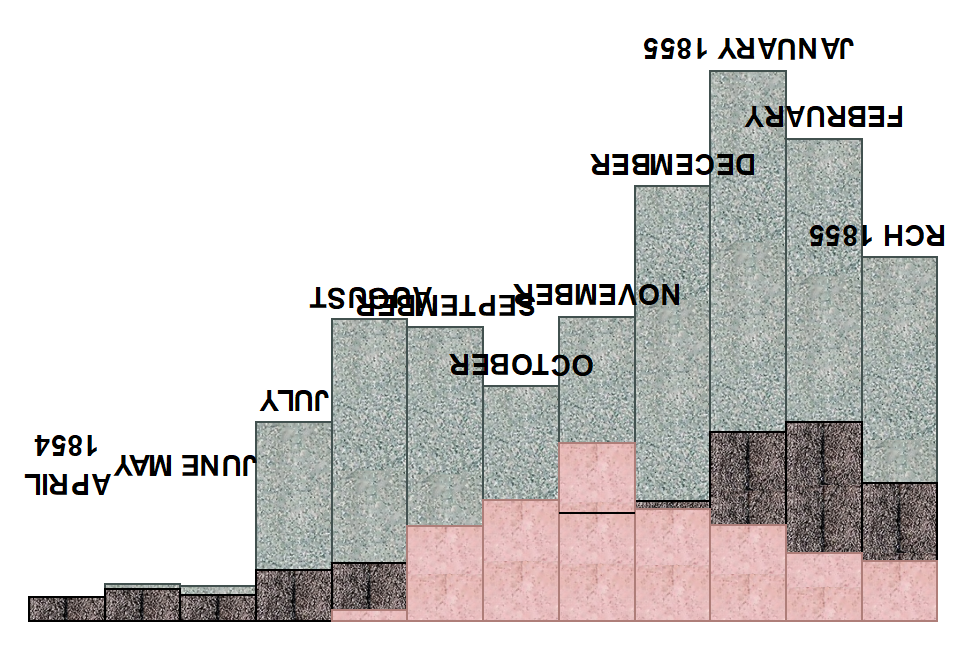
Next, the labels are defined manually and allocated a height (variable y) above the bars.
labels <- scurvy1a %>%
  mutate(
    label = c(
      "APRIL\n1854", "MAY", "JUNE", "JULY", "AUGUST", "SEPTEMBER", "OCTOBER", "NOVEMBER",
      "DECEMBER", "JANUARY 1855", "FEBRUARY", "MARCH 1855"
      ),
    y = if_else(
      r < 4, 3.8, r + 0.5
    ),
    `Cause of Death` = NA
  )
We remove the legend, the axis labels and titles and add the custom annotation layer. In order to do this, we use geom_textpath, which makes it possible to curve the labels just like in the original. We also need to turn the labels on their head because otherwise their direction will be wrong later on.
p2 <- p1 +
  # because ggplot's geom_text will not be curved with coord_polar
  geom_textpath(
    mapping = aes(x = tmp, y = y, label = label),
    data = labels,
    color = "black",
    upright = FALSE,
    fontface = "bold",
    # Turn the letters upside down -
    # otherwise they'll be upside down once we change coord
    angle = 180
    ) +
  # remove all the clutter we don't need
  theme(
    axis.title = element_blank(),
    axis.text = element_blank(),
    axis.ticks = element_blank(),
    legend.position = "none",
    panel.background = element_blank()
  ) +
  # the one black line she describes in the legend
  annotate(geom = "segment", x = 7.5, xend = 8.5, y = 2.66, yend = 2.66)

p2
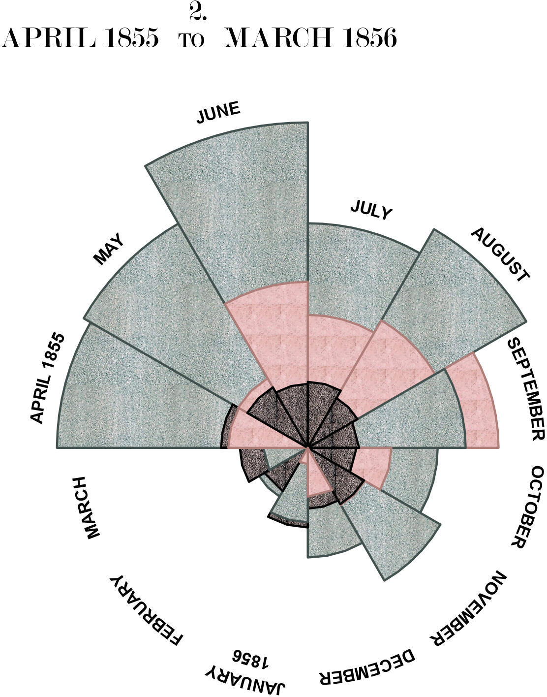
Nightingale’s original titles all contain text with different font sizes in the same line. This is difficult to do with R’s internal functions (I think it might work using expressions), but trivial using ggtext and html. Finally, we add polar coordinates to the plot. This introduces a lot of whitespace because the margins are based on the original bars, which is extremely difficult to remove in ggplot directly. A slightly hacky solution is to export the finished plot and then crop all the whitespace on the sides using knitr::plot_crop.
# define the title in html because of the different text sizes
plot.title <- '
  <span style="font-size:21px;">2.</span> <br>
  <span style="font-size:21px;">APRIL 1855 </span>
  <span style="font-size:15px;">TO</span>
  <span style="font-size:21px;"> MARCH 1856</span>
'

plot1 <- p2 +
  # change to polar coordinates
  coord_polar(start = 1.5*pi, direction = 1)   +
  # and add labels manually
  annotate(
    geom = "richtext",
    x = 4, y = 8.5, vjust = 0,
    family = "Modern No. 20", label.colour = "white",
    label = plot.title
    ) +
  theme(plot.margin = margin(-150, -250, -70, -250))

ggsave(here::here("static/img/scurvy", "plot1.jpg"), plot1, width = 12, height = 12)
knitr::plot_crop(here::here("static/img/scurvy", "plot1.jpg"))
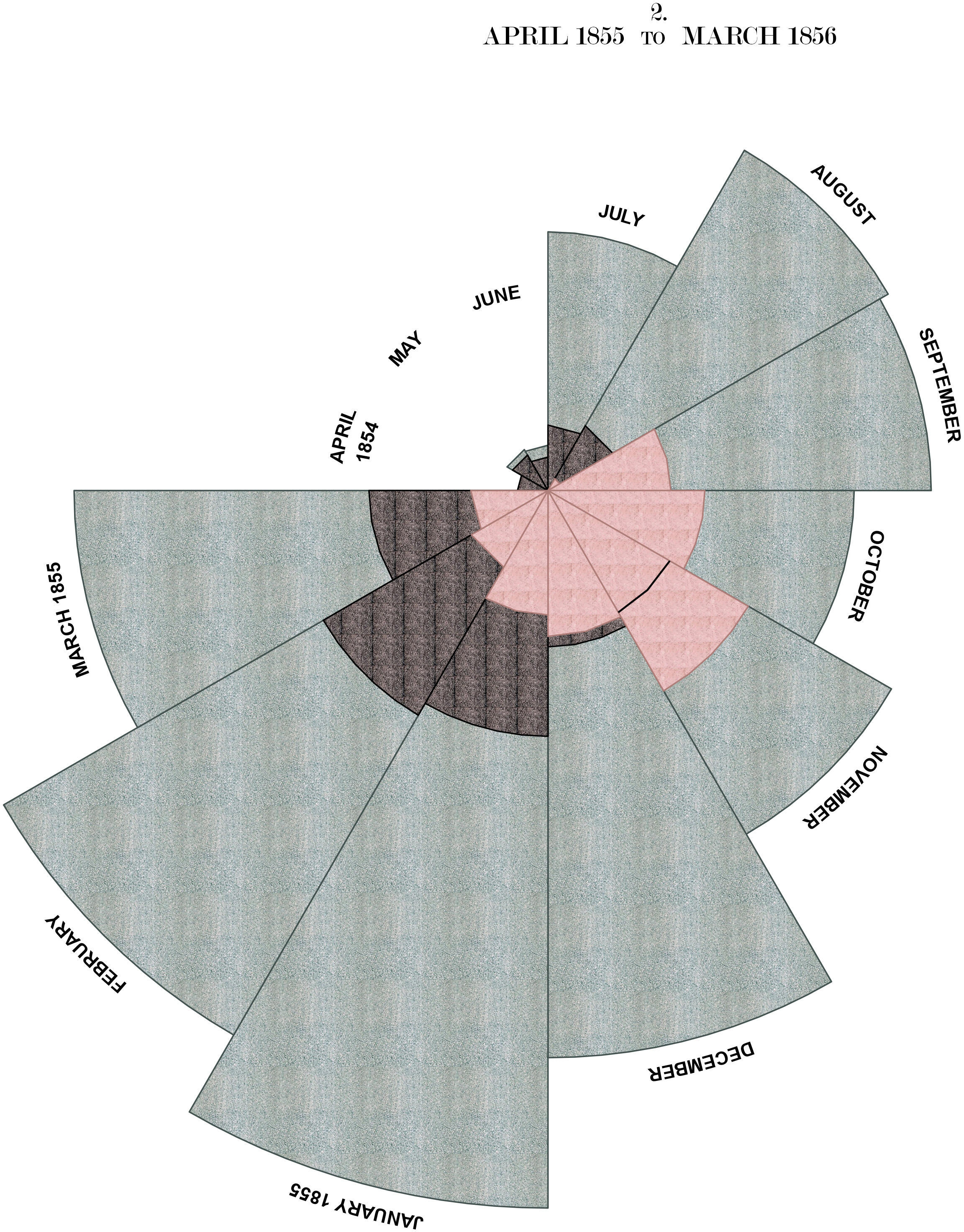
2 April 1855 to March 1856
The second plot can be done in much the same way, with one relatively big difference: Here the order in which the colors are layered isn’t determined by the category of cause of death, but rather by the number of deaths in each category.
scurvy2 <- scurvy %>%
  filter(Year == 1856 | Year == 1855 & !(Month %in% c("January", "February", "March"))) %>%
  arrange(Year, Month) %>%
  mutate(tmp = as.factor(rep(1:12, each = 3)))

scurvy2a <- scurvy2 %>%
  group_by(tmp) %>%
  filter(r == max(r)) %>%
  ungroup()
scurvy2b <- scurvy2 %>%
  group_by(tmp) %>%
  filter(r != max(r) & r != min(r) & r > 0) %>%
  ungroup()
scurvy2c <- scurvy2 %>%
  group_by(tmp) %>%
  filter(r == min(r) & r > 0) %>%
  ungroup()

# Labels - note here that the figure is much smaller,
# but the text doesn't scale down the same way
labels <- scurvy2a %>%
  mutate(
    label = c(
      "APRIL 1855", "MAY", "JUNE", "JULY", "AUGUST", "SEPTEMBER", "OCTOBER", "NOVEMBER",
      "DECEMBER", "JANUARY\n1856", "FEBRUARY", "MARCH"
      ),
    y = if_else(
      r < 5, 5.2, r + 0.5
    ),
    `Cause of Death` = NA
  )

plot.title <- '
  <span style="font-size:20px;">2.</span> <br>
  <span style="font-size:20px;">APRIL 1855 </span>
  <span style="font-size:14px;">TO</span>
  <span style="font-size:20px;"> MARCH 1856</span>
'


# Put the figure together
plot2 <- scurvy2 %>%
  ggplot(aes(tmp, r)) +
    geom_bar_pattern(
      data = scurvy2a,
      aes(tmp, r, color = `Cause of Death`, pattern_filename = `Cause of Death`),
      stat = "identity",
      position = "identity",
      alpha = 0.7,
      pattern = "image",    # rather than color we use pattern from image
      pattern_type = "tile",
      width = 1    # to remove space between bars
      ) +
    geom_bar_pattern(
      data = scurvy2b,
      aes(tmp, r, color = `Cause of Death`, pattern_filename = `Cause of Death`),
      stat = "identity",
      position = "identity",
      alpha = 0.7,
      pattern = "image",    # rather than color we use pattern from image
      pattern_type = "tile",
      width = 1    # to remove space between bars
      ) +
    geom_bar_pattern(
      data = scurvy2c,
      aes(tmp, r, color = `Cause of Death`, pattern_filename = `Cause of Death`),
      stat = "identity",
      position = "identity",
      alpha = 0.7,
      pattern = "image",    # rather than color we use pattern from image
      pattern_type = "tile",
      width = 1    # to remove space between bars
      ) +
  scale_pattern_filename_manual(
    values = c(
      "Zymotic Diseases" = "color_zymotic.jpg",
      "Wounds and Injuries" = "color_death.jpg",
      "All other Causes" = "color_other.jpg")
    )  +
  scale_color_manual(
    values = c(
      "Zymotic Diseases" = "#42514f",
      "Wounds and Injuries" = "#ae7e79",
      "All other Causes" = "black")
    ) +
  geom_textpath(
    mapping = aes(x = tmp, y = y, label = label),
    data = labels,
    color = "black",
    upright = FALSE,
    fontface = "bold",
    # Turn the letters upside down - otherwise they'll point in the wrong
    # direction once we change coord
    angle = 180,
    size = 3
    ) +
  scale_y_continuous(limits = c(0, 9.75)) +
  theme(
    axis.title = element_blank(),
    axis.text = element_blank(),
    axis.ticks = element_blank(),
    legend.position = "none",
    panel.background = element_blank(),
    plot.margin = margin(0, -100, -100, -100)
  ) +
  coord_polar(start = 1.5*pi, direction = 1)  +
  annotate(
    geom = "richtext",
    x = 3, y = 9, vjust = 0,
    family = "Modern No. 20", label.colour = "white",
    label = plot.title
    )

ggsave(here::here("static/img/scurvy", "plot2.jpg"), plot2, width = 6, height = 6)
knitr::plot_crop(here::here("static/img/scurvy", "plot2.jpg"))
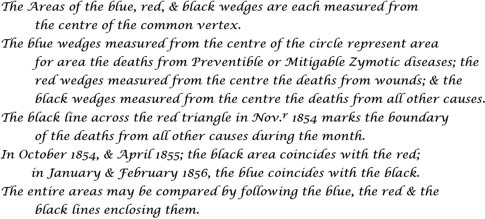
The Legend
In order to define the legend we again use ggtext::geom_richtext, which allows us to write in html. This makes it much easier to use multiple lines and special formatting, like superscript in this case. It was difficult to find a font that was similar to Nightingale’s handwriting, so I picked Lucida Calligraphy, which seemed like the best bet – still a far way off.
lbl <- '
<span style="font-size:13px;">
  The Areas of the blue, red, & black wedges are each measured from
  <br>
  <span style="font-size:13px;color:white">
    emp
  </span>
  the centre of the common vertex.
  <br>
  The blue wedges measured from the centre of the circle represent area
  <br>
  <span style="font-size:13px;color:white">
    emp
  </span>
  for area the deaths from Preventible or Mitigable Zymotic diseases; the
  <br>
  <span style="font-size:13px;color:white">
    emp
  </span>
  red wedges measured from the centre the deaths from wounds; & the
  <br>
  <span style="font-size:13px;color:white">
    emp
  </span>
  black wedges measured from the centre the deaths from all other causes.
  <br>
  The black line across the red triangle in Nov.<sup>r</sup> 1854 marks the boundary
  <br>
  <span style="font-size:13px;color:white">
    emp
  </span>
  of the deaths from all other causes during the month.
  <br>
  In October 1854, & April 1855; the black area coincides with the red;
  <br>
  <span style="font-size:13px;color:white">
    emp
  </span>in January & February 1856, the blue coincides with the black.
  <br>
  The entire areas may be compared by following the blue, the red & the
  <br>
  <span style="font-size:13px;color:white">
    emp
  </span>
  black lines enclosing them.
</span>
'

leg <- ggplot() +
  theme_void() +
  scale_x_continuous(limits = c(0,105)) +
  scale_y_continuous(limits = c(75,125)) +
  annotate(
    geom = "richtext",
    x = 0, y = 100, vjust = 0.5, hjust = 0,
    fill = NA, label.color = NA, # remove background and outline
    label.padding = grid::unit(rep(0, 4), "pt"), # remove padding
    family = "Lucida Calligraphy",
    label = lbl,
    lineheight = 1.4
    ) +
  coord_fixed(1)

ggsave(here::here("static/img/scurvy", "legend.jpg"), leg, width = 6, height = 5, bg = "white")
knitr::plot_crop(here::here("static/img/scurvy", "legend.jpg"))
The Title(s)
The main title and subtitle of the plot are defined in the same way, using geom_richtext. Notably this would have been very difficult to do in ggplot if we didn’t have the ability to use html because of the different font sizes. Similar to above, I couldn’t find a font that was similar enough to Nightingale’s handwriting.
plot.title <- '
  <span style="font-size:28px;">DIAGRAM </span>
  <span style="font-size:20px;">OF THE</span>
  <span style="font-size:28px;"> CAUSES </span>
  <span style="font-size:20px;">OF</span>
  <span style="font-size:28px;"> MORTALITY</span>
'

plot.subtitle <- '
  <span style="font-size:16px;">IN THE</span>
  <span style="font-size:22px;"> ARMY </span>
  <span style="font-size:16px;">IN THE</span>
  <span style="font-size:22px;"> EAST.</span>
'

titles <- ggplot() +
  theme_void() +
  scale_x_continuous(limits = c(0,100)) +
  scale_y_continuous(limits = c(97,100)) +
  annotate(
    geom = "richtext",
    x = 50, y = 99, vjust = 0,
    family = "Modern No. 20", label.colour = "white",
    label = plot.title
    ) +
  annotate(
    geom = "richtext",
    x = 50, y = 98.3, vjust = 0,
    label.colour = "white",
    label = plot.subtitle
    ) +
  annotate(geom = "segment", x = 44, y = 98, xend = 56, yend = 97.97) +
  annotate(geom = "segment", x = 43, y = 97.9, xend = 57, yend = 97.9)

ggsave(here::here("static/img/scurvy", "titles.jpg"), titles, width = 12, height = 1, bg = "white")
knitr::plot_crop(here::here("static/img/scurvy", "titles.jpg"))

Putting it all together
Because each of the four different elements was already saved as a .jpg file and cropped, it is relatively easy to put together using cowplot. We simply read in each picture, then arrange them on an empty ggplot, remove the background and add the dashed annotation line.
plot1 <- readJPEG("plot1.jpg", native = TRUE)
plot2 <- readJPEG("plot2.jpg", native = TRUE)
lbl <- readJPEG("legend.jpg", native = TRUE)
titles <- readJPEG("titles.jpg", native = TRUE)

rose <- ggplot() +
  scale_x_continuous(limits = c(0, 300)) +
  scale_y_continuous(limits = c(0, 210)) +
  draw_image(
    image = plot2, x = 0, y = 100, width = 100, height = 100
    ) +
  draw_image(
    image = lbl, x = 2.5, y = 2.5, width = 150, height = 80
    ) +
  draw_image(
    image = plot1, x = 150, y = 2.5, width = 150, height = 199
    ) +
  draw_image(
    image = titles, x = 150, y = 200, width = 150,
    height = 15, hjust = 0.5, vjust = 0.5
    ) +
  annotate(
    geom = "segment", x = 163.5, xend = 89, y = 122, yend = 100,
    linetype = "dashed", size = 0.5
    ) +
  annotate(
    geom = "segment", x = 88.5, xend = 20.5, y = 100, yend = 136,
    linetype = "dashed", size = 0.5
    ) +
  theme_void() +
  theme(
    panel.background = element_rect(fill = "white")
  )

ggsave(here::here("static/img/scurvy", "rose.jpg"), rose, width = 16, height = 10.5, bg = "white")
Et voila! My version of the rose:
Citation
Jonas Schropp (Apr 12, 2022) Of Scurvy in the Army. Retrieved from /blog/2022-04-01-of-scurvy-in-the-army/index/
@misc{ 2022-of-scurvy-in-the-army,
author = { Jonas Schropp },
title = { Of Scurvy in the Army },
url = { /blog/2022-04-01-of-scurvy-in-the-army/index/ },
year = { 2022 }
updated = { Apr 12, 2022 }
}